BRAND GUIDELINES
Boston Harbor belongs to all of us. To every neighborhood, every community, and every story that meets the water. It’s a place to gather. To discover. To celebrate. To belong. From beaches and boats to communities across the waterfront, we believe everyone deserves the chance to experience, enjoy, and care for Boston Harbor. The spirit of the waterfront shapes who we are: welcoming, vibrant, thoughtful, and full of possibility.
We are Boston Harbor.
BRAND VOICE
4 Pillars
Welcoming : We make everyone feel invited, included, and like they belong from the very first interaction.
Thoughtful: We communicate with intention, listen with care, and create experiences that make people feel seen, informed, and valued.
Energetic: We bring enthusiasm, curiosity, humor, and creativity to everything we do, encouraging people to participate, connect, and have fun.
Authentic: We're approachable, colorful, and unapologetically ourselves. We celebrate individuality while creating space for everyone.
| We Are | We Aren't |
|---|---|
| Warm | Cold or robotic |
| Conversational | Corporate or overly formal |
| Confident | Preachy |
| Playful | Unprofessional |
| Informative | Overwhelming |
| Authentic | Performative |
DESIGN PRINCIPLES
Trusted, Welcoming, Vibrant, Coastal & Flexible
COLORS
NAVY
Deep harbor water & trust
HARBOR BLUE
Open water & activities
SEA FOAM
Waves & clean water
SAND
Beaches & accessibility
SUNSHINE
Summer & community
DUNE GREEN
Coastal grasses & restoration
PRIMARY COLORS
NAVY
#00305C
HARBOR BLUE
#0073B3
SEA FOAM
#EAF5F3
SECONDARY COLORS
SAND
#F8EECE
SUNSHINE
#FFC845
ACCENTS
DUNE GREEN
#D6E264
COLOR RELATIONSHIPS PER FOCUS AREA
Better Beaches & Beach Programs:
Warm, inviting, and community
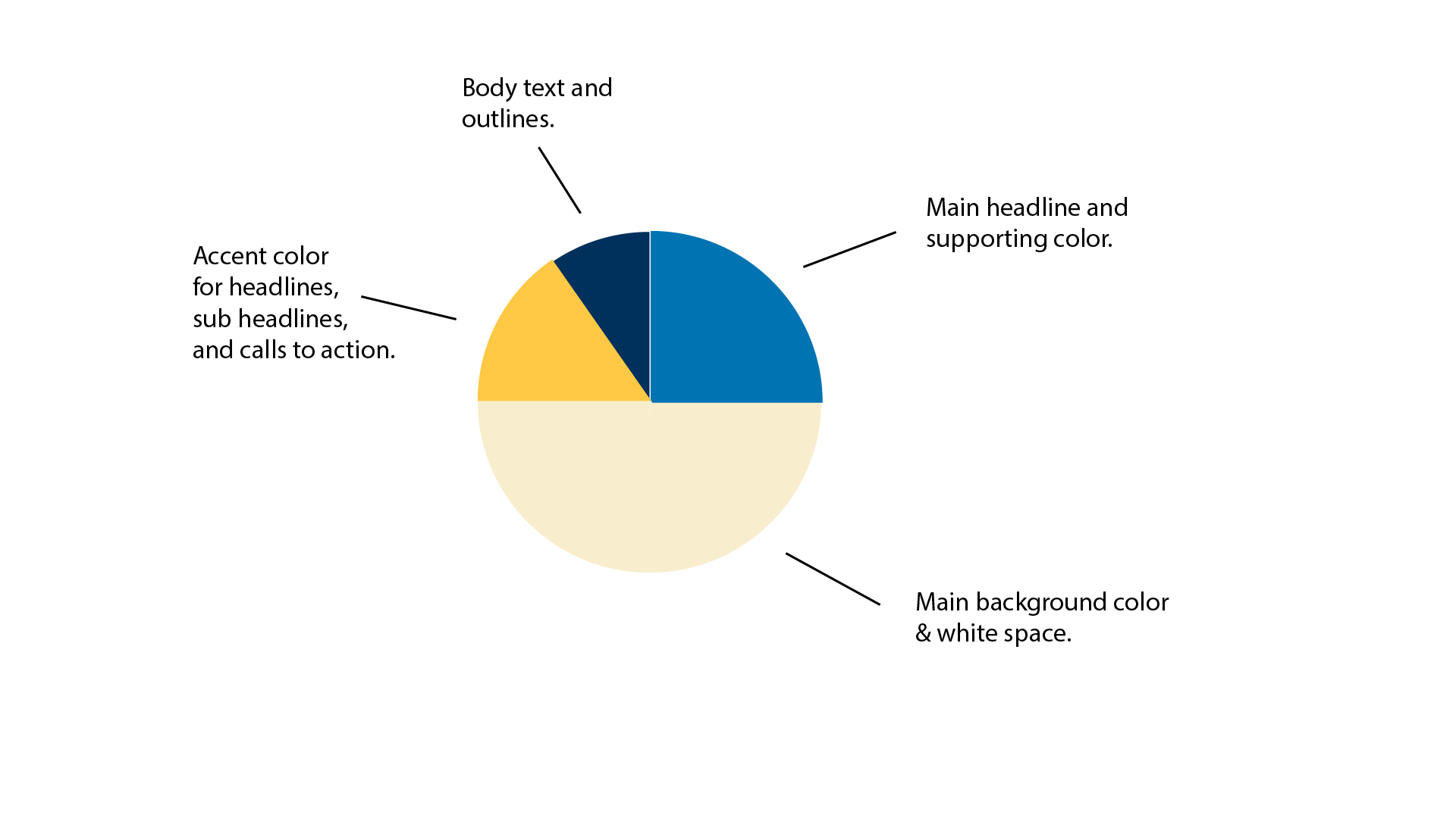
Use Sand as the foundation, Harbor Blue for main headlines and key information, Sunshine to call attention to important details, and Navy for body text and outlines.
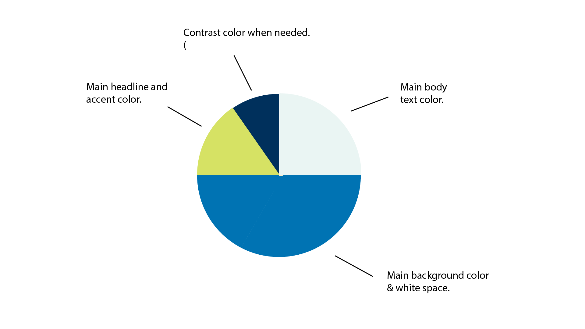
Youth Programs:
Vibrant & fun
Lead with Harbor Blue for an energetic feel, using Seafoam to balance it, Dune Green for important highlights, and Navy when extra contrast is needed.
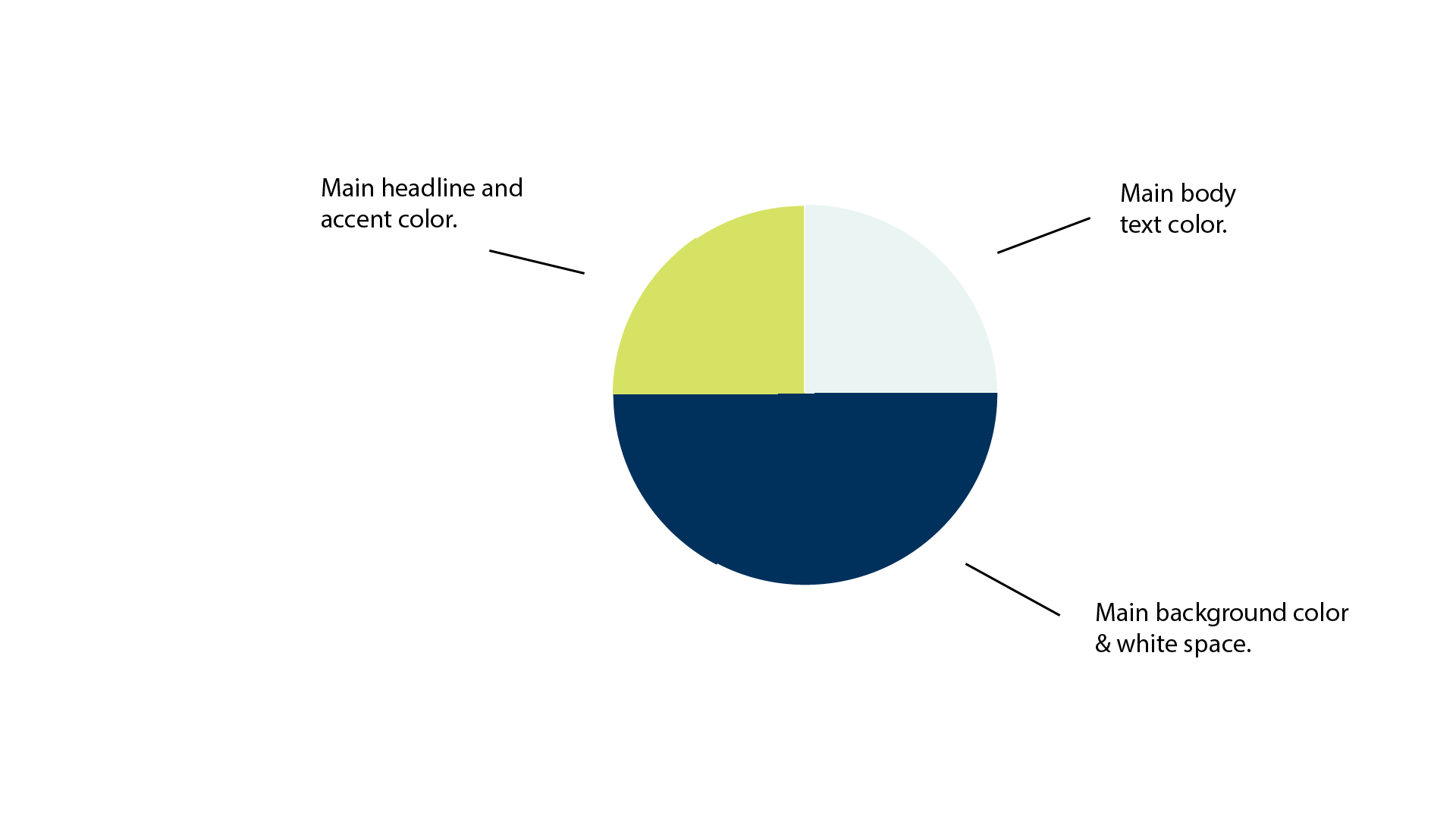
Policy:
Trustworthy & Scientific

Use Navy as the primary color to keep materials clear and credible, Sea Foam for body text or softer supporting areas, and Dune Green to highlight key information.
Fundraising:
Trustworthy & Welcoming.
Use Navy as the foundation, Sunshine for headlines and important calls to action, and Sand for body text or softer supporting elements.
BRAND ASSETS
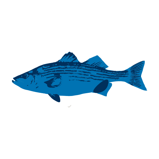
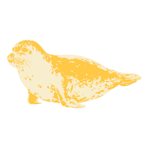
ICONS/GRAPHICS


PATTERNS